User Interface
- Stonebranch (Deactivated)
Overview
The Universal Controller 7.4.x user interface is comprised of two basic elements:
- Home page
- Services
Home Page
When you log in to the Universal Controller 7.4.x user interface, your Universal Controller home page displays.
The home page contains the Home Dashboard and a panel on the left side of the page that lists any Services that you had selected for easy access.
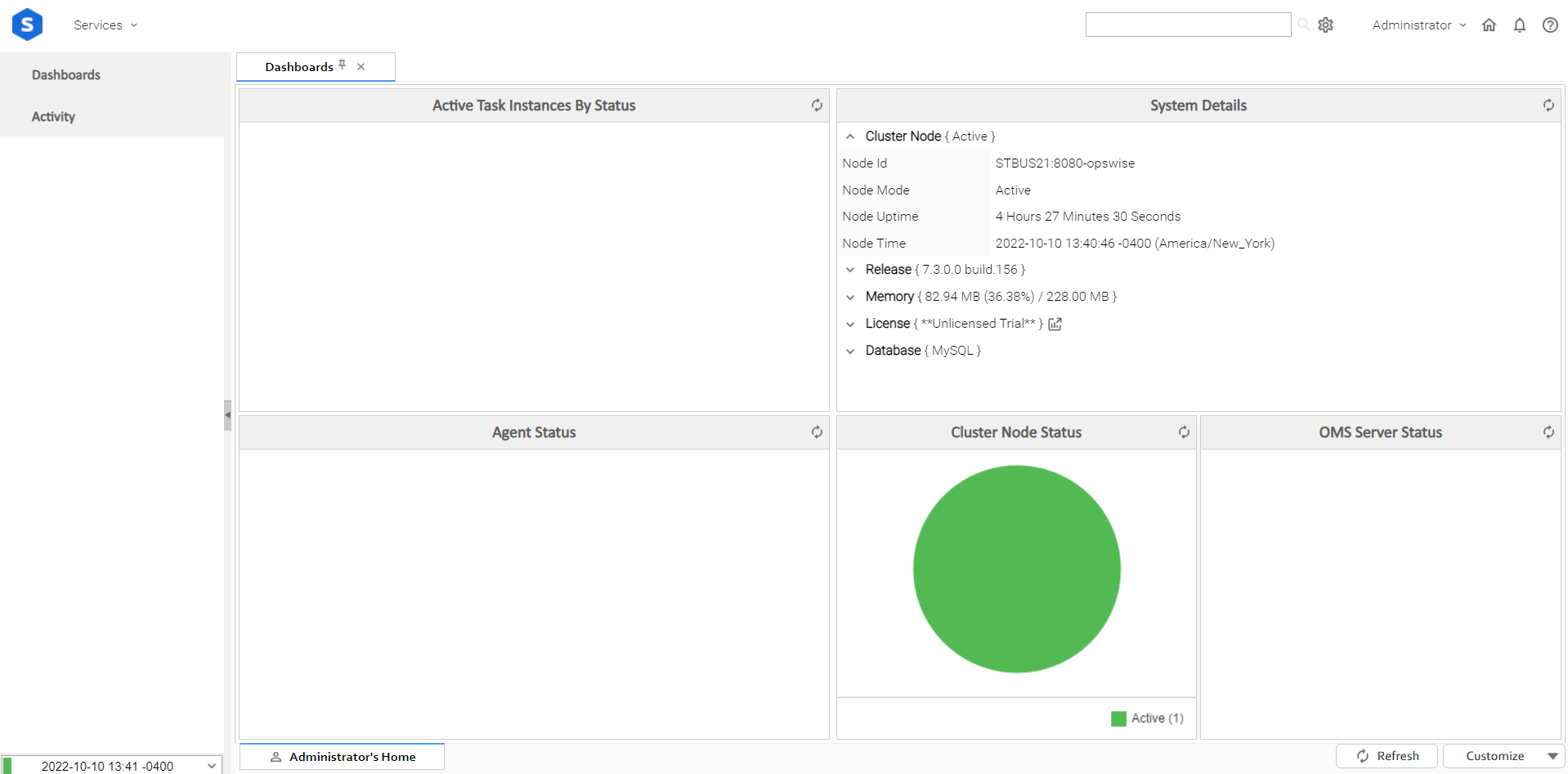
User Interface Details
In addition to the Home Dashboard and user-selected links to areas in Services, the Home Page - and all pages accessed via Services - contains the following information (except where noted).
| Section | Description |
|---|---|
| Link to the Stonebranch website. |
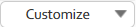
| Link to the Universal Controller Services available in the user interface. |
| Search field that enables you to search for a Name, Description, and Member of Business Services across multiple record types. The Search icon lets you select which field types to search for. |
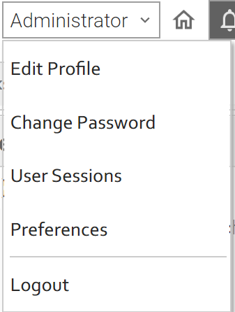
| User-specific information for the logged in user.
|
| Links to:
|
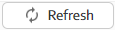
| Time and node status (System Details). |
| Home page only; Refreshes the information displayed on this page. |
| Home page only:
Note You cannot Edit or Delete the Home Dashboard. |


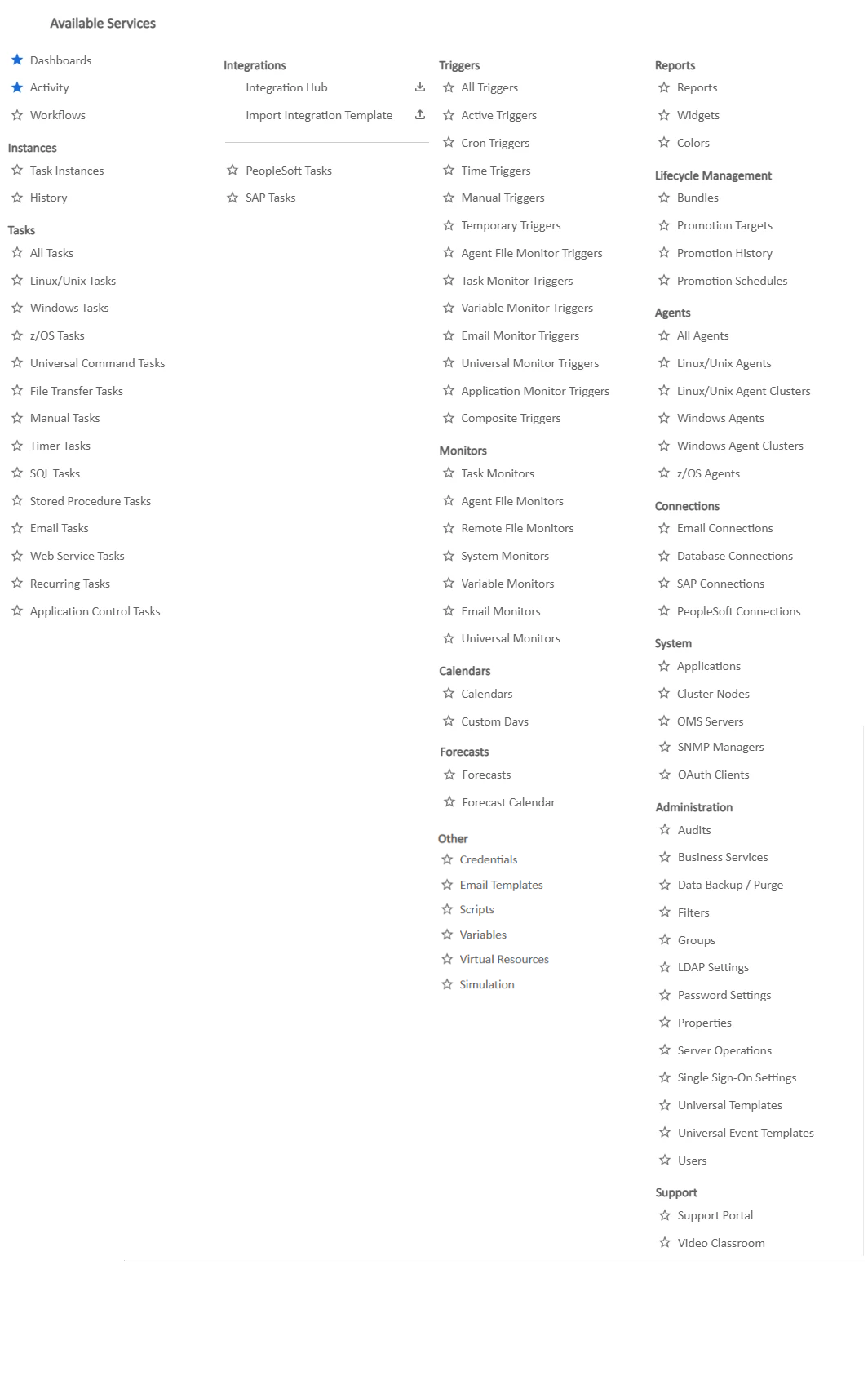
Available Services
All of the record types are under Available Services
To add a record type to the home page navigation panel, click the star icon ( U) next to the record type in Available Services
To create a record for a record type while in Available Services, click the new icon ( + ) next to that record type
Global Search
Global Search enables you to search the user interface for Name, Description, and/or Member of Business Services for the following record types:
- Agent
- Agent Cluster
- Application
- Bundle
- Bundle Target
- Calendar
- Credentials
- Database Connection
- Email Connection
- Email Template
- Oath Client
- OMS Server
- PeopleSoft Connection
- SAP Connection
- Script
- SNMP Manager
- Task
- Trigger
- Variable
- Virtual Resource
- Webhook
You can search for:
- Exact field:
Enter a specific record name. - Partial field:
Enter partial text and use a question mark ( ? ) to replace any single character. - Wildcard:
Use a wildcard ( * ) to match one or more matching values (for example: t*, Test*, *est*.
Note
You can receive search results only for records for which you have read access.
Performing a Global Search:
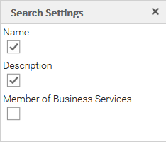
- Click the Settings icon on the User Task Bar to configure which fields to search. By default, the Name and Description fields are selected.
- In the Search field, enter the text to search for. (Search text is not case sensitive.)
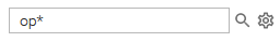
- Click the Search icon to perform the search.
A list of any search results then displays.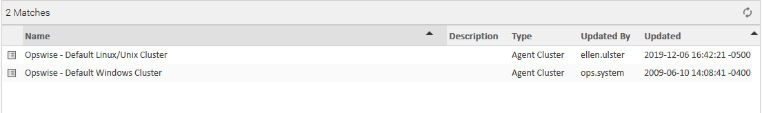
Customizing the Banner
You can customize the Universal Automation Center banner that displays across the top of the page by changing the banner logo.
Changing the Banner Background Color
To change the background color of the banner, enter a new hexadecimal value in the Banner Background Color Universal Controller system property.
Changing the Banner Logo
Step 1 | Copy the logo file that you want to use in the banner to the
|
|---|---|
Step 2 | Login to the Universal Controller (or any Controller cluster node in a High Availability system) and update the Banner Logo Universal Controller system property to the name of the logo file (excluding path) that you copied to the |
Step 3 | If you want the logo to link to a web resource, enter the URL for the web resource in the Banner Logo URL Universal Controller system property. |
Note
If you update the currently configured banner logo file in the uc_images folder, as long as the banner logo file size has changed, it will be redeployed automatically. If you do not see the updated banner logo from the user interface, try running the Clear Server Cache server operation and/or clearing your browser cache.
Drop-Down Lists
Many record Details contain drop-down lists of available values for specific fields.
For example, the record Details for a User contains a drop-down list of titles that can be assigned to the User:
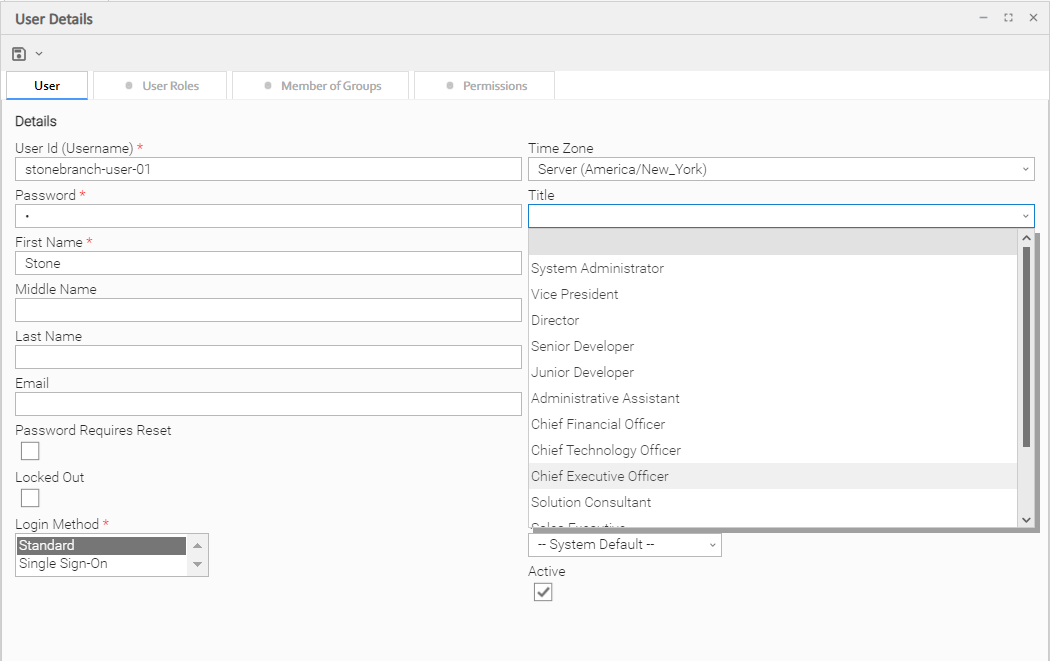
To select a value from a drop-down list, either:
- Click the drop-down list arrow and then click a value.
- Begin entering the name of a value in the drop-down list field. A list of values that match your entry then displays. Click a displayed value.
Console
The Console contains informational and error messages regarding recent Controller activity.
For example:
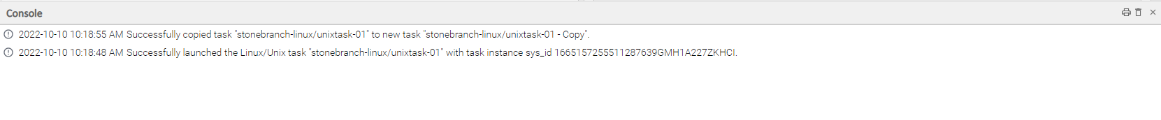
The Console opens automatically to display error ( x ) messages, and you can set the Console to open automatically to display information ( i ) messages (via one of four user preferences that allow you to control the Console display).
Note
Error messages related to specific fields are displayed next to the fields themselves in the record Details, not in the Console.
You also can open the Console manually at any time by clicking the Universal Automation Center Console icon on the User Task Bar.
Console Actions
Action | Icon | Description |
|---|---|---|
Select and Copy | n/a | Select message text either of three ways:
Use Ctrl+C and Ctrl+V to copy and paste the selected text. You also can select and copy text this way from the Print Preview pop-up (see Print in this table). |
| Click the Print icon at the top of the Console to display a Print Preview pop-up, and then click the Print button. | |
Trash |
| Click the Trash icon at the top of the Console to empty the contents of the Console. |
Close |
| Close the Console either by:
|
Tabs
Every page in the user interface displays, when selected, under a tab at the top of the page. The tab for the page currently being viewed is white; all other tabs are gray.
When you log in to the Controller, the Home dashboard displays under a Dashboards tab. The Home dashboard - as well as the Activity Monitor and Dashboard Details - remain open throughout your session unless you manually close them by clicking the x icon in the tab itself. The tabs for those pages otherwise remain at the top of the screen so that you can quickly return to them at any time.
For example:
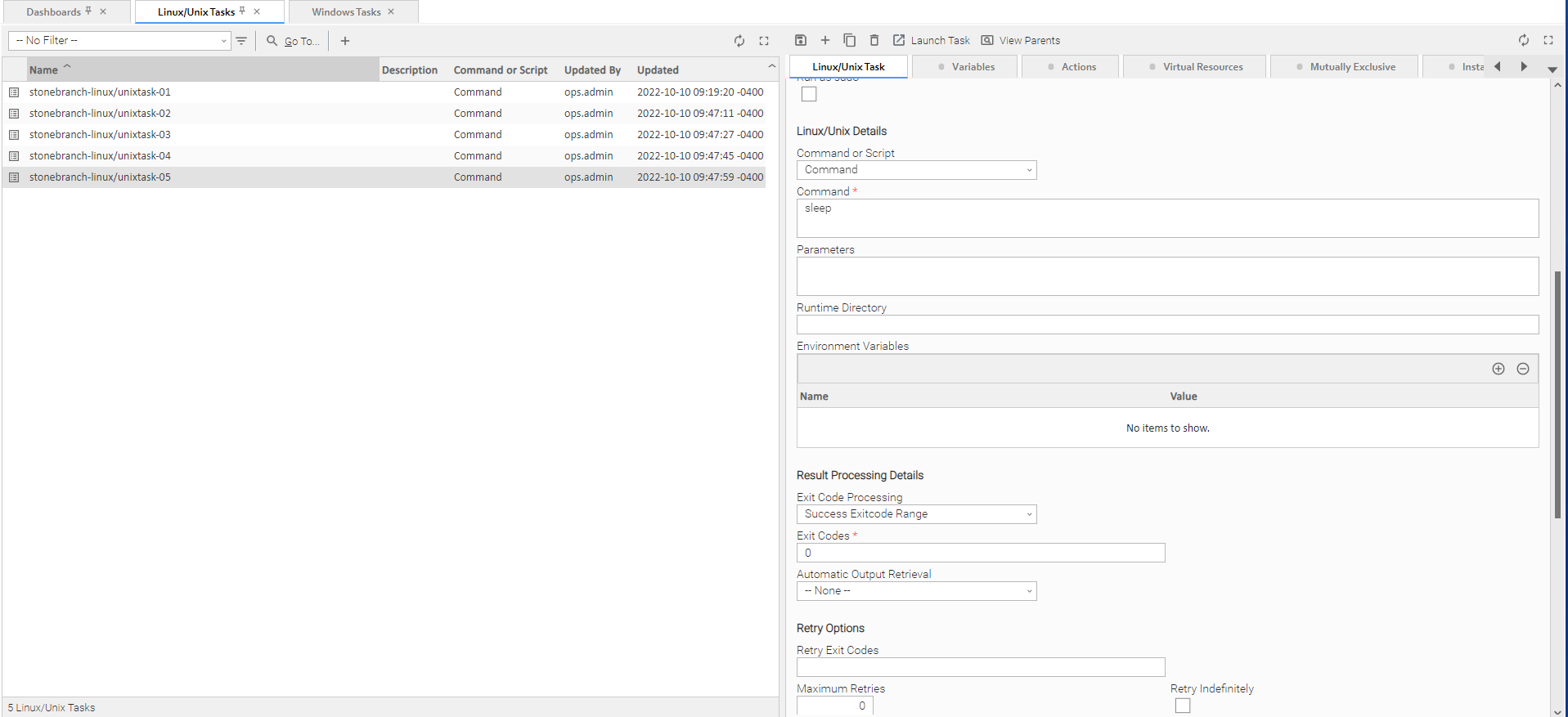
If you select a page in the Services while viewing Dashboards, Activity Monitor, or Server Operations, a new tab will open for that page. The Dashboards, Activity Monitor, and Server Operations tabs are pinned automatically to the top of the page and will remain open if you navigate from them.
If you select a page in the Services while viewing any other page, the Tabs Pinned Automatically user preference specifies whether or not that page is pinned.
Note
When you close the tab for the page currently being viewed, you return to the tab for the previous page that you viewed, not the tab for the page that you last opened.
Pinning Tabs
You can pin tabs to the top of the page so that the pinned page displays even if you select other pages to display. You also can unpin any pinned tabs at any time (see the Tabs action menu).
The following tabs are pinned automatically and will not close unless you manually close them either by clicking the x icon on the tab or close them via the Tabs action menu.
- Dashboards
- Activity
- Server Operation
Pinned tabs are identified with a pin icon next to the tab name.
Any tab pinned during the current user session will display as pinned when the tab is opened again in a future user session, until the tab is unpinned.
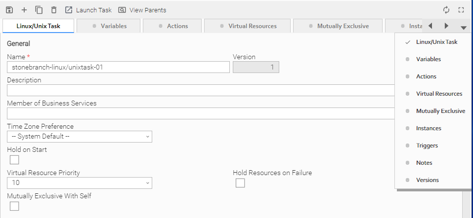
Tab Picker
If you open more tabs that can be displayed on your screen, tab picker icons display that let you scroll back and forth among the tabs and select any tab from a drop-down list
< | Scroll left through the tabs. |
> | Scroll right through the tabs. |
v | Display a drop-down list of all open tabs. |
For example:
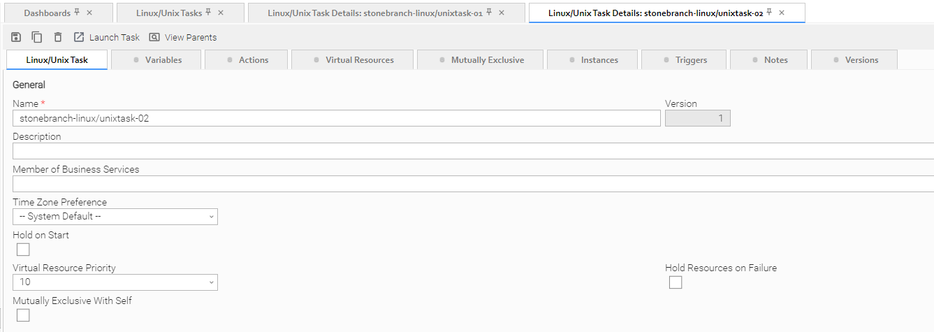
Record Details as Tabs
You also can display record Details as tabs at the top of a page
Step 1 | From a record list, either:
|
|---|---|
Step 2 | In the Action menu, click Open in Tab. The record Details display under a tab at the top of the page. |
Step 3 | If you want to open the same record or another record under another tab, repeat Steps 1 and 2. |
Additional Information
The following pages provide additional information for the Universal Controller user interface: